Yeah, I know, just what the planet needs, yet another Blog. But this one is the OFFICIAL Blog of Illustration-ist, cartoonist, humor- mongerist, greasy Stooge-Shemp Howard-enthusiast, Danny Thomas glass coffee table ponderist Drew Friedman! Happier now?
Dick Van Dyke has long been one of my favorite comedians. His classic sitcom, "The Dick Van Dyke Show" (1961-66), created by Carl Reiner, might well be (arguably) the greatest sitcom in TV history.
After making a sensation starring in the original Broadway production of "Bye Bye Birdie", followed by an easy transition to television star, it seemed inevitable that Dick Van Dyke would become a movie comedy star, which he did. His film debut came in 1963, when he starred in the film version "Bye Bye Birdie" a box office hit, then co-starred the following year with Julie Andrews in the mega Walt Disney smash "Mary Poppins".
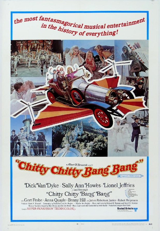
Dick Van Dyke's eventual problem though was that "The Dick Van Dyke Show" had set the bar so high for television comedy, and Rob and Laura Petrie were such familiar and beloved characters in America's homes, that equalling that writing and performing standard in his movies would sadly wind up being a near impossible task, and audiences finally had trouble excepting him as anybody other than Rob Petrie. Van Dyke (or his agents?) also had a knack for picking (mostly) lousy film projects, either coy, silly "sex comedies", which were in abundance in the mid sixties, or watered down Disney family fare, appearing in one critical and box office dud after another, his only other genuine hit being the late sixties family musical "Chitty Chitty Bang Bang". As on TV, Van Dyke was always extremely appealing and likable in his films (His TV wife Mary Tyler Moore would also suffer a similar fate attempting to make the transition to movies), yet his movie career wound up being brief, petering out after only 8 years and 12 films, before he returned to the relatively safer world of television sitcoms, dramas, and live theatre.
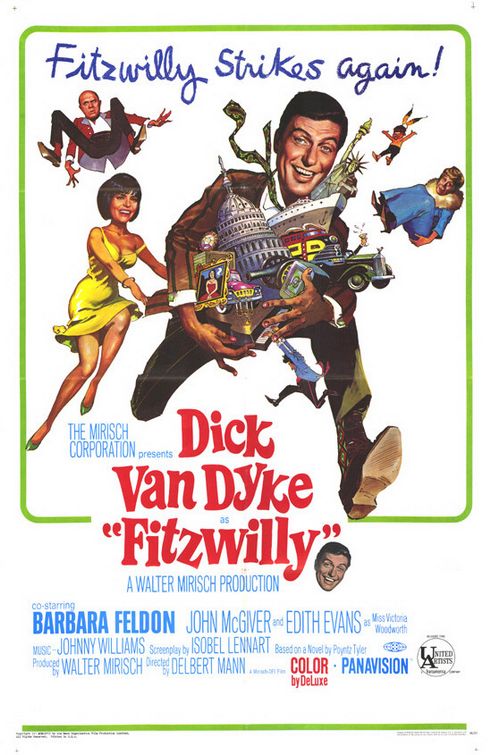
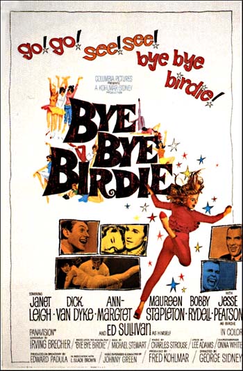
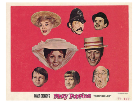
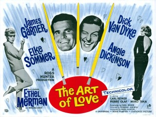
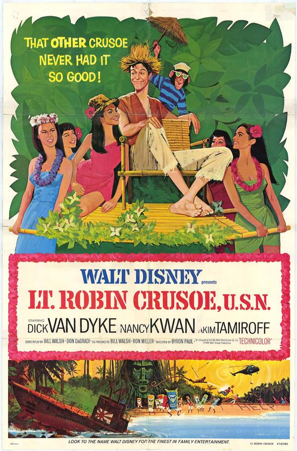
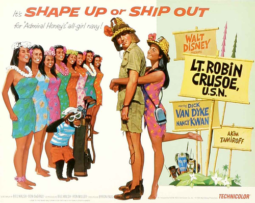
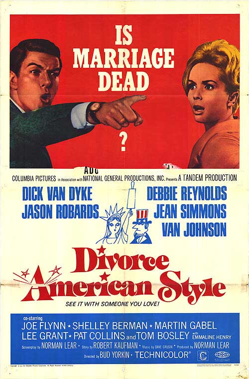
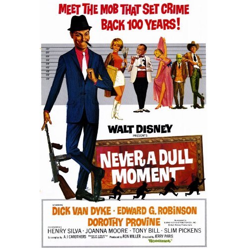
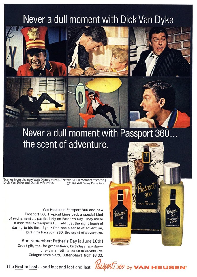
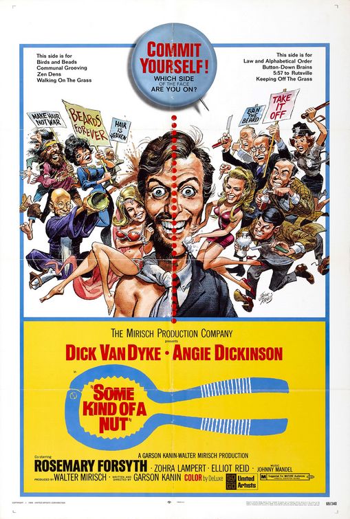
I've included all of his starring/co-starring film posters, dating from 1963-71, and one from 1979. As in the case of so many other films, the majority of the posters are far superior to the actual films.
Dick Van Dyke's first film, repeating his stage role as failed songwriter Albert Peterson. Van Dyke disliked the film version, which highlighted (for good reason) new sex kitten starlet Ann-Margret. The director George Sidney was clearly smitten with her, building up her part (which was far smaller in the original show) and repeatedly shooting her in lovingly soft-focus close-ups. After Van Dyke returned from watching a preview, he muttered to his Dick Van Dyke Show co-star Rose Marie "If you're my friend, you will never go see "Bye Bye Birdie".
Yet Bye Bye Birdie is a funny, fun, fast-paced musical comedy, featuring a great cast (overall), especially Van Dyke, Paul Lynde and Ed Sullivan himself, a sexy Ann-Margret, a clever screenplay adaption by legendary comedy writer Irving Brecher, and terrific songs from the original show. It was rightfully a big hit.
Put on a Happy Face
Van Dyke had a small cameo role in this so-so Shirley MacLaine comedy
The original poster for Mary Poppins, which transformed Dick Van Dyke as Burt the chimney sweep (with a faux British accent), into a major movie star.
Van Dyke's first "sixties sex comedy", featuring Ethel Merman as "Madame Coco"
British poster
the Australian version of the poster. The Aussie's had a knack for never being able to capture an American likeness on a film poster.
the paperback cover
Lovely art (by one of the James Bond poster artists), lousy film, though the chimp was funny.
Another version. Yup, the chimp clearly steals the show
and another
yet another...
and the best yet
the paperback cover
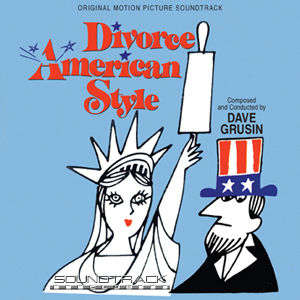
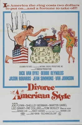
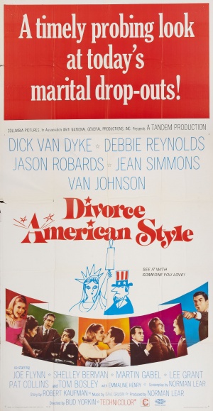
This film is actually pretty good, from "Tandem" the new team of Bud Yorkin and Norman Lear, the American answer to "Divorce Italian Style", but a "pointless" poster (who is he pointing at? And why?), aside from the cartoon art, a larger version of which was wisely featured on the cover of the soundtrack album.
A more amusing illustrated poster for the British version and a spanish version...
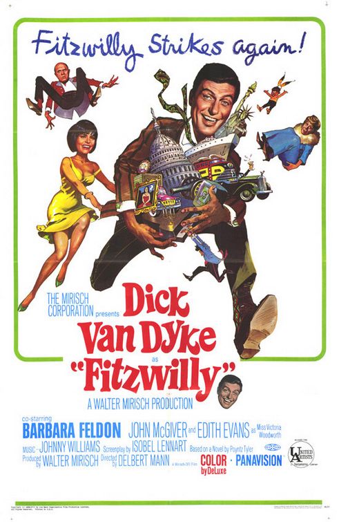
Van Dyke plays a lovable criminal British butler in this likable caper film comedy. Poster art by the one and only Frank Frazetta. The heads of the 4 stars are actually photographs pasted over the artwork that Frazetta was asked by the studio to retouch, an approach he was not at all happy with.
Same film, different Fitzwilly pose
"Star of the year" for 1965
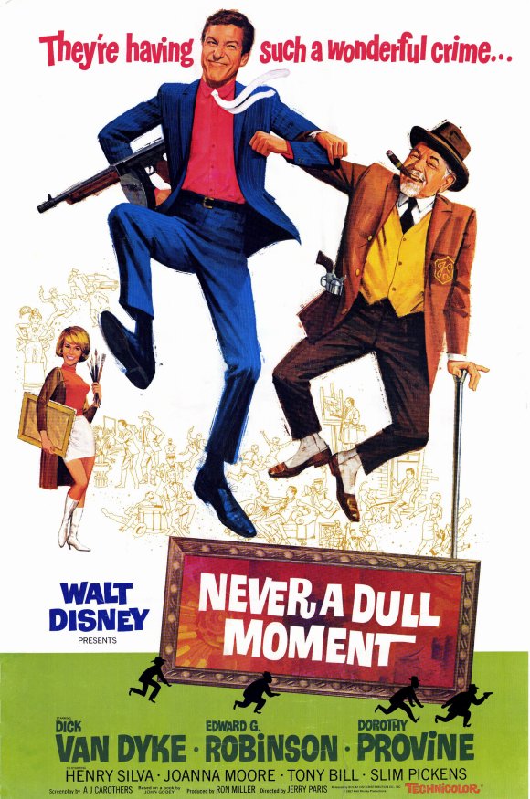
... but always a Dull film. An unfunny, lifeless clinker with a fun poster.
A second poster version
and a third
the Danish poster
From the same folks who brought you James Bond, and another hit musical comedy for Dick Van Dyke (not attempting a British accent this time around.
Van Dyke gets the full throttle Jack Davis poster treatment. Another incredibly dopey comedy flop (written and directed by Garson Kanin, attempting late sixties "hipness") about a bank teller who of all things, grows a beard, and the wackiness that ensues. This is rated "Bomb" in Leonard Maltin's movie guide for good reason.
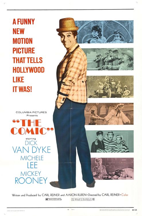
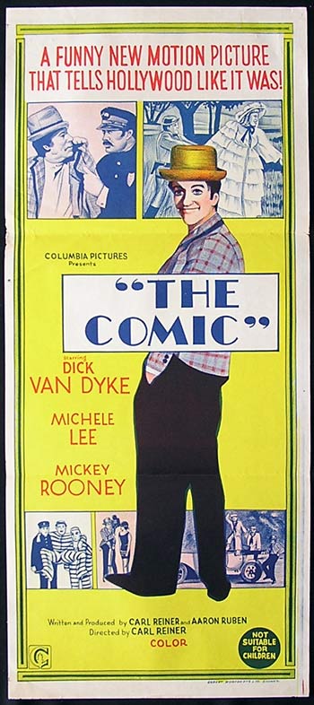
"The Comic" was a long planned dream project for Dick Van Dyke and writer/director Carl Reiner, a fictional biography of a troubled, self destructive silent film comedian named Billy Bright, loosely based on Buster Keaton, with a little Stan Laurel, Harry Langdon and Lloyd Hamilton thrown in.
The film premiered in 1969 with barely a notice (I saw it shortly after it opened on second bill with "The Desperado's" starring Vince Edwards... which actually wasn't bad!), but over the years it's become a cult favorite. It's heavily flawed, much of the dialog between Van Dyke and Michelle Lee sounds far too similar to Rob and Laura Petrie dialog, actors appear in the 1920's with late sixties haircuts and sideburns, Billy Bright's erratic behavior is never fully explained, the late sixties color is too garish, etc)...
Yet the film still has some unforgettable sequences recreating vintage silent film comedy, a memorable Steve Allen show sequence and an hilarious Billy Bright TV commercial for "Whitey White", a great, subtle performance by Mickey Rooney as fellow film comic and pal "Cockeye", and especially Dick Van Dyke, Oscar worthy as Billy Bright, particularly during his sad final days, old, bald, alone and forgotten in his small Hollywood apartment.
Would some company please finally get this out on DVD! Sheesh!!
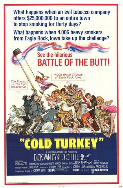
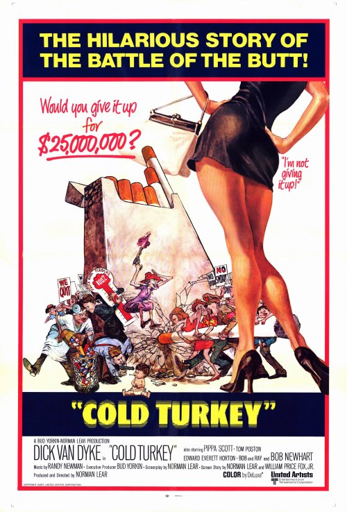
Dick Van Dyke's final starring film comedy role, from 1971, a wild, darkly funny and hip satire with a terrific cast (including Bob Newhart, Tom Poston and Bob & Ray!) about a town going smoke-free for one month. This was the only film directed by Norman Lear just before he created "All in the Family". Still, the box office did poorly and the 46 year old Van Dyke returned to TV to star in "The NEW Dick Van Dyke show"
Great poster art by Sanford Kossin!
Screenwriter Larry Karaszewski's "Trailers from Hell": Cold Turkey
When "Cold Turkey" began to tank at the box office, this second Sanford Kossin poster was created adding a bit more sex appeal.
in 1979, Dick Van Dyke returned to the screen to star in Stanley Kramer's final film, this dreary drama, based on the Broadway play of the same name. It received negative reviews and was a box office failure, and would also be Van Dyke's last starring film role.
Thanks to Leonard Maltin, Jerry Beck, Dan Yaccarino, Stephen Kroninger, Vice Waldren and Larry Karaszewski
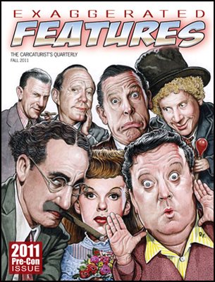
My cover to the caricaturist's quarterly (originally the cover art
for "The Wicked Wit of the West" by Irving Brecher)
One of the highlights of my year was appearing as the invited guest speaker at this year's International Caricaturists Convention in early Nov, held at the Tradewinds resort in St. Pete's Beach, Florida. The convention ran for five days, and was attended by hundreds of professional and novice caricaturists from all around the world.
This convention is unique, in that that it's a "working convention", the caricaturists sit in the large pavilion and draw (mainly each other) throughout the duration of the convention, their results finally displayed for competition, the winners announced at the awards banquet on the final night.
I provided the keynote visual address for the convention :"Old Jewish Comedians and me", as well as a second visual presentation; "Adventures and misadventures", detailing my career high points and low points, and all points in between (making sure there were no children in attendance). The most enjoyable part of the convention for me (aside from the sun, and the beach, and the pool, and the food, and the...) was getting to meet so many talented artists, watching them work and witnessing their amazing results. My thanks again to everyone at ISCA (International Society of Caricature Artists) for being so kind to my wife and I.
Next years guest speaker, the great John Kascht.
The beautiful Tradewinds resort at St. Pete's Beach (free plug! I expect a room upgrade next time)
some highlights from the ISCA convention via Brent Brown.
the always dapper Brit, Steve Hearn, the president of ISCA (with his gorgeous Florida suntan), me, and artist Brent Brown
Steve Hearn by Court Jones
preparing to begin my keynote presentation. My projected name helped to remind me of exactly who I was.
Part of my keynote PP presentation. Explaining what I liked drawing the most and combining them, Old Jews, and Comedians, I showed this cover image of George W. Bush as a comedian example. I had the honor of being the first artist to draw Bush on the cover of a national magazine, just after he announced his candidacy for presidency in 1999.
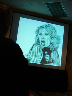
my portrait of Old Jewish comedienne, Joan Rivers
After my second presentation, I entertained questions from the ISCA audience. Here are some Highlights. (thanks to Steven Kaufman for transcribing)
Q. (Audience member): When did you decide to be an artist?
A. (DF): When I was a little kid, right off the bat. All I wanted to do was draw, draw faces. I didn’t want to go to school, I didn’t want to go out and play, I didn't want to go to camp, all I wanted to do was draw, read comic books and MAD, and watch TV. I watched Our Gang, The Three Stooges, F-Troop, Popeye cartoons, Superman, Soupy Sales, old horror and comedy movies... That's the only education I was interested in. To me school was a complete waste of time. I knew that then and I still believe it. I still resent being sent to school. And It was always drawing faces, an obsession with ugly faces, to this day. My type of caricature is closer to slight distortion rather than over the top caricature. Sometimes it can be over the top, but I'm more of a 'portrait artist" I suppose. I'm hard to pinpoint. I tend to jump around from caricature, to portraits, to comics, editorial illustration, cartoons...
My dad has made the observation that "Drew always notices the people that nobody else notices", Which is true. Aside from famous and obscure celebrities, I’ve been drawn to draw elevator operators, waiters, bus drivers, cab drivers, gas station attendants, comic shop clerks...
... people no one would think to draw or pay tribute to.
Q. (Tom Richmond): What absolutely amazes me about what you do – you’re an illustrator’s illustrator. A lot of theses guys here love to do faces, but I like how your work has a narrative aspect to it. You bring that in along with the beautiful drawings.
Another thing - most illustrators, when they do work for magazines work 150% to print size or bigger - so it gets nice and tight when it gets shrunk down. It makes you look like you really know what you’re doing. You work at print-size, so what we see printed in a magazine is exactly the size you worked at – with the incredible detail you give it.
A. (DF): I got into that early, when I was doing stipple. The dots, the thousands of dots. With stipple work especially, you had to be just an inch from the page while you're doing it. These days I work the brush. Some color pencil, mostly just water color. All on paper. I don’t work on a computer. I just do it the old-fashioned way like I’ve worked for the last 30 years. But like Tom, I like doing the small details. I love getting into those panels and focusing on the tiny background details that most other artists wouldn't think were important, the "chicken fat" as Harvey Kurtzman called it.
I’ve heard from art directors over the years who’ve said they’ve kind of grown up with my stuff, especially my comic strips. They knew it was just different from the kind of things they were seeing. I think a lot of them appreciated seeing the effort I was putting into it, especially when I was doing the stipple. Every little detail I think about.
Putting the extra effort in, like the great Tom Richmond does, people really appreciate that, I’ve found.
Q. (Audience member): Did you take classes?
A. (DF): I went to The School of Visual Arts in New York, where a lot of great caricaturists and cartoonists taught at the time. HarveyKurtzman, taught there. Will Eisner, Art Spiegelman, Stan Mack, Edward Sorel, Arnold Roth. Not all of them great teachers but still It was kind of a golden era.
Q. (Audience member): Do you think the quality of MAD’s gone down since William M. Gaines died?
A. (DF): Well.. I think the quality went way UP... because they hired me as an artist soon after Bill Gaines died! (laughter from audience) It went sky high after that. I'm just not sure who reads MAD now. Kids, do they really buy magazines or comics anymore? It now comes out just six times a year... and there’s still some terrific work in there. Tom Richmond is a regular – his stuff is great. He’s the new Mort Drucker. Hermann Mejia is terrific. The computer generated covers by Mark Fredricson are first rate. And many of the old time idiots still contribute like Sergio and Al Jaffee. There’s still some great stuff they run in there, art wise and the writing too, but I don't think it's same as it once was – it’s not as essential as it once was. Jon Stewart is instant, MAD magazine isn't, although their blog is.
Q. (Dave "Bippy" Boyer): In your Old Jewish Comedians books, your approach celebrates these seniors. I didn’t see anything acidic in there, you’re really celebrating these guys.
A. (DF): I’ve gotten criticized for my liver spots…but I’m glad you appreciate that. I’d like to think I am celebrating them – not making fun of them. I wanted in my way to pay tribute to them, honor them. Most of them I loved and like I said, many of the older comedians like The Three Stooges, The Marx Brothers, Jerry Lewis, Sid Caesar, Jack Benny, Zero Mostel, Phil Silvers – so many were Jewish. Or happen to be Jewish. By simple process of elimination, most of my favorite comedians happen to be Jewish comedians, but not across the board. I love Ernie Kovacs for instance. Also Buster Keaton, Bob Hope, Lou Costello, Jackie Gleason, Jimmy Kimmel...
I like to think when comedians aren’t Jewish, if they’re really funny, they should be Jewish. There's a story of George Burns and Groucho sitting together, enjoying Bill Cosby doing a routine on TV. At one point Burns turns to Groucho and says "Too bad he's not Jewish". There’s a guy in my new book, Stan Freberg. Turns out he’s not Jewish. I made a mistake, should have researched a little more. I assumed he was Jewish because his name was "Freberg". Who knew? My excuse was he's so brilliant, clever and funny, I just naturally assumed he was Jewish.
Q. (Audience member): Do you have a sense of where the computer will take things? What do you think is going to happen in two to five years?
A. (DF): I can’t predict. When young people say, ‘how do I get into it?’ – I say "are you sure you really want to get into it?" Magazine illustration is in flux. Entertainment Weekly hardly runs any illustrations anymore. Most of the work I do now is personal work – for books and commissions. I’ve kind of come full circle. Originally I was doing personal work about obscure actors and celebrities – work for myself and my friends. I didn’t even think of getting published. And then little by little, I segued into commercial illustration. I’m now doing Old Jewish Comedians and Side Show Freaks – work that I’m passionate about rather than thinking about pleasing an art director…
I still do lots of editorial work but it’s just not the same as it was. I pick and choose now more often than before. I’ve talked to many other illustrators – and they’re sitting around and waiting for the phone to ring. Maybe I’ve been more fortunate because I’ve been around and made some noise and people know what to expect from me. It’s not like I’m introducing myself as a new guy which I think would be hard. Not impossible.
Q. (Audience member): How do you find your references? Is it hard to find photos of these guys – they’re not in the public eye anymore.
A. (DF): I’d kept files over the years, collected various photos, since I was a kid really. Especially the comedians, but whatever looks interesting or worth saving. Not just standard photographs, smiling full-face resume photographs, which I hate. I always went out of my way to collect side views of people, profiles, celebrities or every day folks looking down or away from the camera. I love just getting half of a person’s face… But these days you can just google anything and everything comes up. It’s pretty amazing.
Q. (Eve Myles): Your Frank Sinatra portrait has so many decades in it – it has some young, some middle, some old. It’s just phenomenal, don’t you think?
A. (DF): Well... I can’t say? I... don’t like it. I don’t think it’s very good. Don’t ask me...
I drew Sinatra for a New York Observer tribute to him by Peter Bogdanovich and Gay Talese the weekend after he died. He died on a Friday, so I worked on Saturday and Sunday with his music playing in the background. I love Frank Sinatra, but I wasn’t in tears, yet it was very emotional to work on that piece. I wanted to capture his cockiness and also his sensitivity. That’s one aspect I love about him and his music – he can convey being cocky almost at the same time as being sensitive. I wanted the portrait to somehow portray that. The tilt of the hat, the raised shoulder, the drink and cigarette, conveys the famous Sinatra arrogance. Then the uncertainty of the hand in pocket – a little bit of insecurity there, the other lowered shoulder, and the "please like me" expression hopefully conveying the other side.
Q. (Audience member): Are you still evolving your techniques?
A. (DF): I like the word “evolving.” I evolved from the stipple style to phasing that out slowly to become a watercolor artist. I was nervous about it because I sort of established myself as a stipple artist. I was never necessarily a fan of stipple but it worked for me because it slowed me down. When I was younger I used to work way too fast. As an exercise I started working in stipple – it served the work I was doing. I wanted a realistic look early on with the comic strips - almost photo-realistic, noir-like. A retro kind of look, almost like a secret grainy photo.
Little by little I phased that out without art directors even noticing. Only one guy did, an editor at MAD. It evolved from the stipple to the water color style. Artists should evolve. Don’t get stuck just doing one thing. At least that's how I feel.
Q. (Audience member): Isn’t water color really unforgiving?
A. (DF): Yup, true, It can be heart-breaking at times. Sometimes I think of switching over to oils like Dan Adel or Roberto Parada among others, I love their work, but you got to deal with these fumes and you got to wait for it to dry. It can take days and days. And the mess. Watercolor dries instantaneously. It’s over, you’re finished. run your tray and brushes under the sink. Done. And it goes right into the scanner… I don’t think I'd like working on canvas, I just like working on paper. I'm set in my ways.
Q. (Audience member): Do you see yourself ever going digital?
A. (DF): No. (laughter from audience)
Q. (Audience member): Is there anything you do stylistically to make it yours? Your trademark?
A. (DF): Yes, my trademark is liver spots. Liver spots are my "Ninas". That’ll be my legacy. The guy who drew the liver spots. My obit will start off; "Drew Friedman, who popularized Liver Spots..."
Q. (Audience member): Do any of your subjects try to buy the original work?
A. (DF): Sure, a few. Howard Stern has bought some, the guy who played the Soup Nazi on "Seinfeld", the film producer Harvey Weinstein, Elton John, Jerry Lewis, among others.
There are certain celebrities who, any time they’re drawn, they’ll purchase the piece. Obviously many if not all have large egos. I've heard the comedian Richard Lewis has one room in his home filled with drawings and paintings of himself.
A story I love concerns Al Hirschfeld and Liberace. Hirschfeld did a cover for Collier's magazine of Liberace in the mid-50’s – a beautiful color painting of him sitting at the piano beaming at the reader. So Liberace’s people first contacted Colliers to obtain the art, who informed them the art was returned to Mr. Hirschfeld. They then contacted Hirschfeld and pronounced: "Liberace has collected paintings of himself created by many of the world's GREAT artists, all of whom had requested no compensation, but he also loves your piece and asks that you to send it to him to hang in his home". Al responded: “Why certainly, I’ll send my painting of Liberace for him to hang on his wall alongside the work created by all the great art titans, and in return I would like you to send me Liberace, so I can hang him on my wall.” (laughter)
Liberace by Hirschfeld
drawing in the pavilion
Talking about drawing Howard Stern with artist Glenn Ferguson
creating sculptures. I particularly liked the Trump hair and Steve Jobs
Some of the caricatures created at the convention, on display and ready to be voted on.
with the world's tallest caricaturist (6/9)
with the legend; Dave "Bippy" Boyer
Bippy's virtual convention video tour
Famed caricaturist and MAD regular Tom Richmond was on hand to conduct a poolside drawing seminar. Tom's new book is terrific and essential for anyone who is interested in becoming a caricaturist professionally or just for fun...
As the guest speaker at the convention, I had to vote for my single favorite image, not an easy task, as there were hundreds of incredible pieces to choose from. This one, drawn by "Northern Ireland's top caricaturist" (someone give me his name?) was my second runner up.
This was my first runner up, drawn by Dan Almariei
and my pick for best in show, by 23 year old Marcus Sakoda, a caricature of a fellow conventioneer (OK, I like profiles)
The awards banquet on the final night. The food wasn't bad either!
and a final view from our room (photo by my wife Kathy)
Special thanks to ISCA president Steve Hearn and all the terrific ISCA organizers. Also thanks to Rick Wright and all the other ISCA members who's photos I borrowed for this blog post.
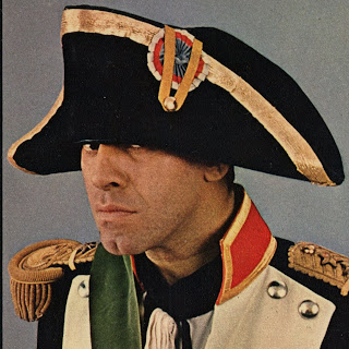
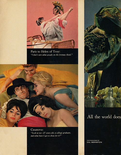
In May, 1961, to coincide with his latest film release "The Ladies Man", Jerry Lewis and some very lovely models appeared in a specially created photo spread, text by Lewis and his writing partner Bill Richmond, for LOOK magazine, spoofing the world's Great Lovers.
The photos were shot by Cal Bernstein, a LOOK staff photographer, who also shot the opening film credit (B&W) stills used in the film (see video below).
This long forgotten spread is from the collection of Jerry Lewis archivist Stephen Kroninger.